Few upcoming films have stirred such immediate aesthetic obsession as Wuthering Heights, the new adaptation of Emily Brontë’s classic, directed by Emerald Fennell. Even before its release, the film has already cemented itself as a visual event. Between the haunting trailers, carefully staged official stills, early critical reactions, and a meticulously styled press tour led by “method press tour” queen Margot Robbie, the aesthetic world of this Wuthering Heights feels fully intentional, immersive, and unmistakably contemporary.
I enjoyed the original novel. I remember reading it in two days when I was a teenager, and it stayed with me forever.
I wouldn’t call myself a fan, however. As we all know, more than ever right now, this literature classic has a huge cult following, and they were not super happy with the new film’s creative liberties, compared to the original story.
But more on that later.
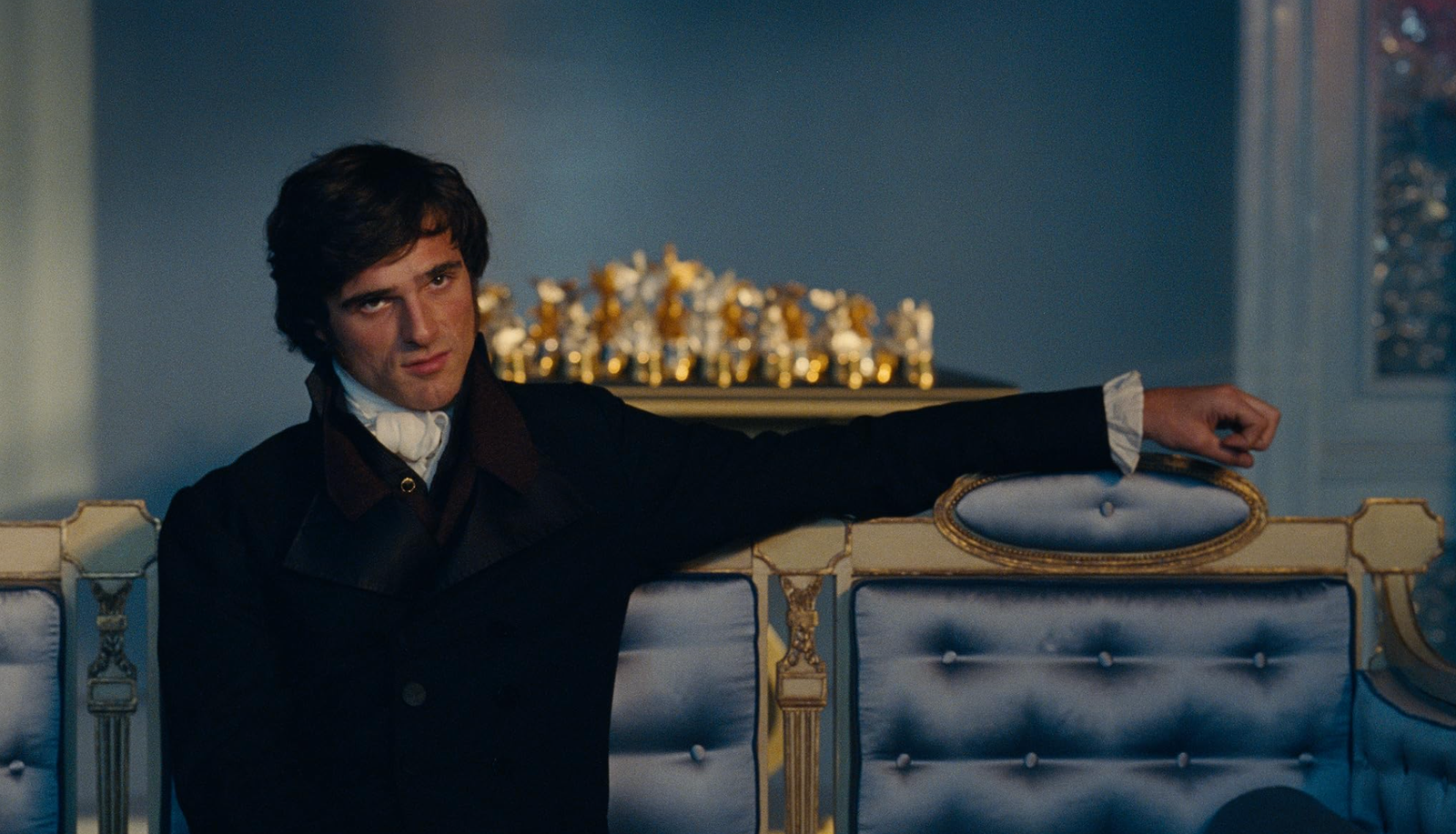
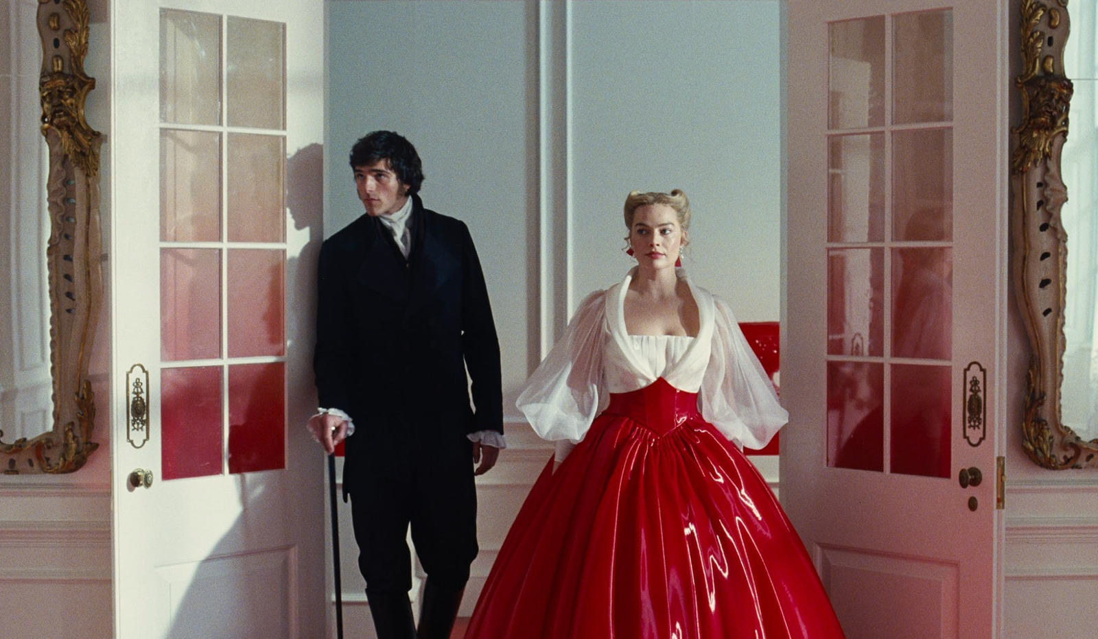
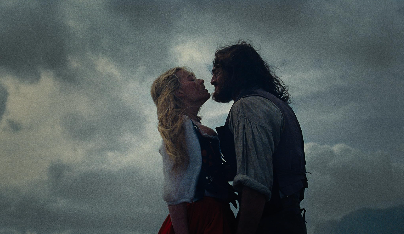
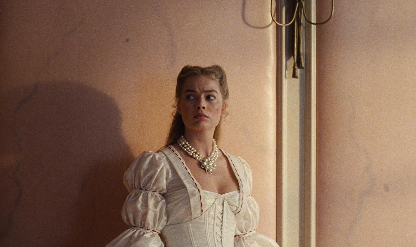
From the material released it was already clear that Fennell was not aiming for a traditional, romanticized period drama. Visually, this Wuthering Heights leans into something harsher, colder, and far more psychological. The film’s atmosphere feels stripped back and elemental, shaped by landscape, silence, and emotional tension rather than ornate historical detail.
Courtesy of Warner Bros. – © Warner Bros.
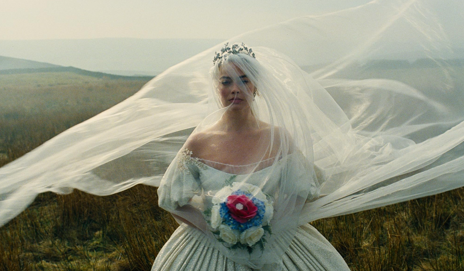
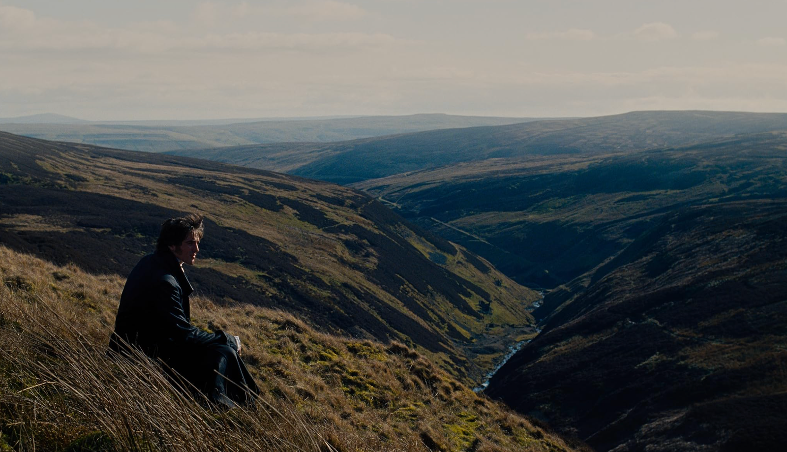
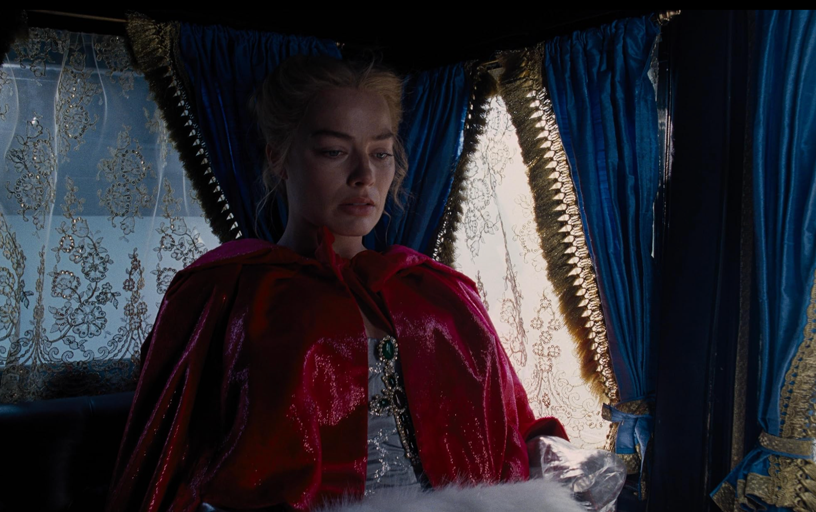
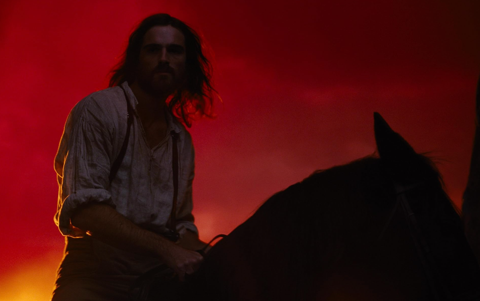
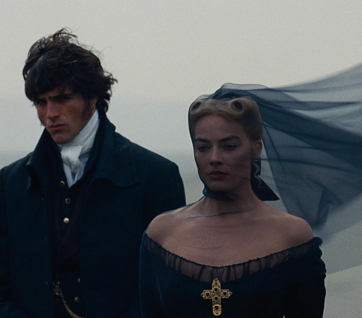
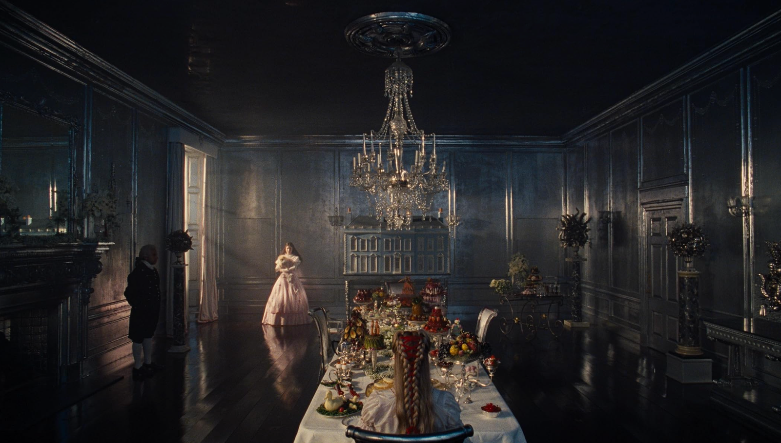
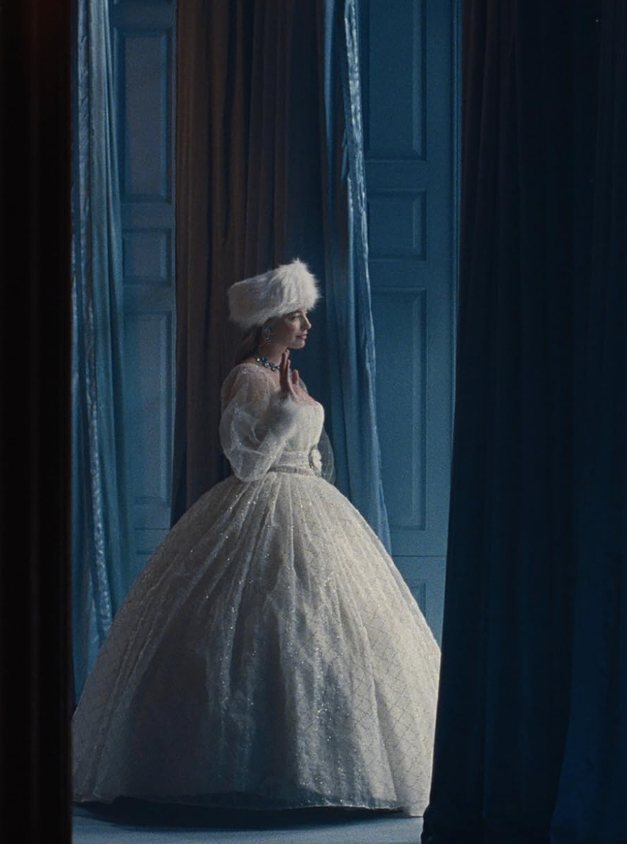
The Yorkshire moors dominate the visual language. Wide shots emphasize emptiness and exposure, with characters often framed against vast, unforgiving horizons. The color palette is restrained and desaturated, built around stormy greys, muddy browns, deep greens, and washed-out blues. Light is frequently diffused by cloud, mist, or rain, giving many scenes a muted, almost weightless quality. There is very little visual warmth. Instead, the cinematography seems designed to mirror emotional isolation and inner turbulence.
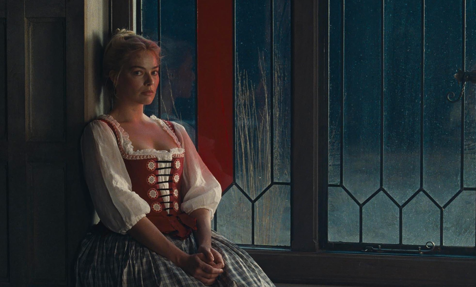
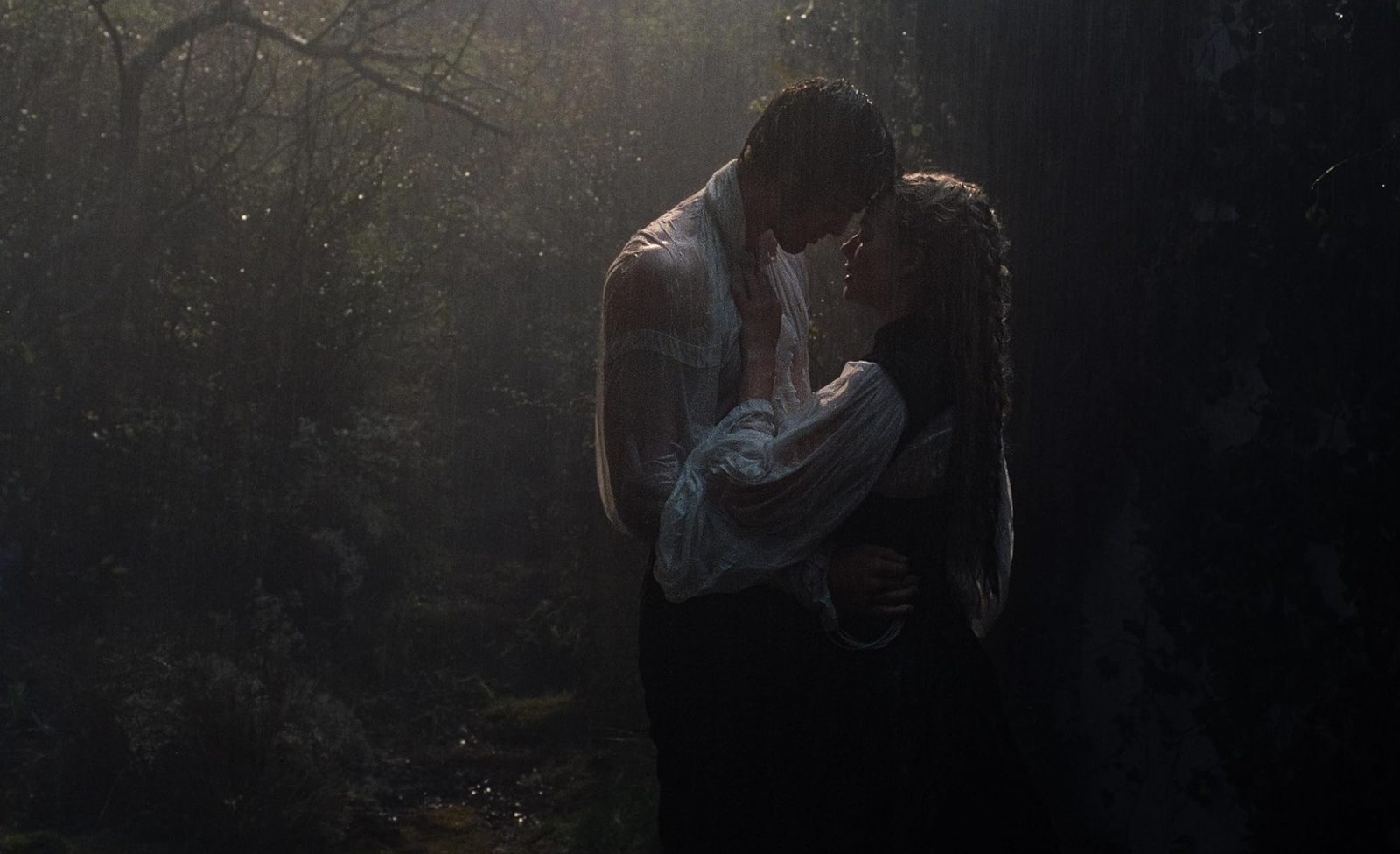
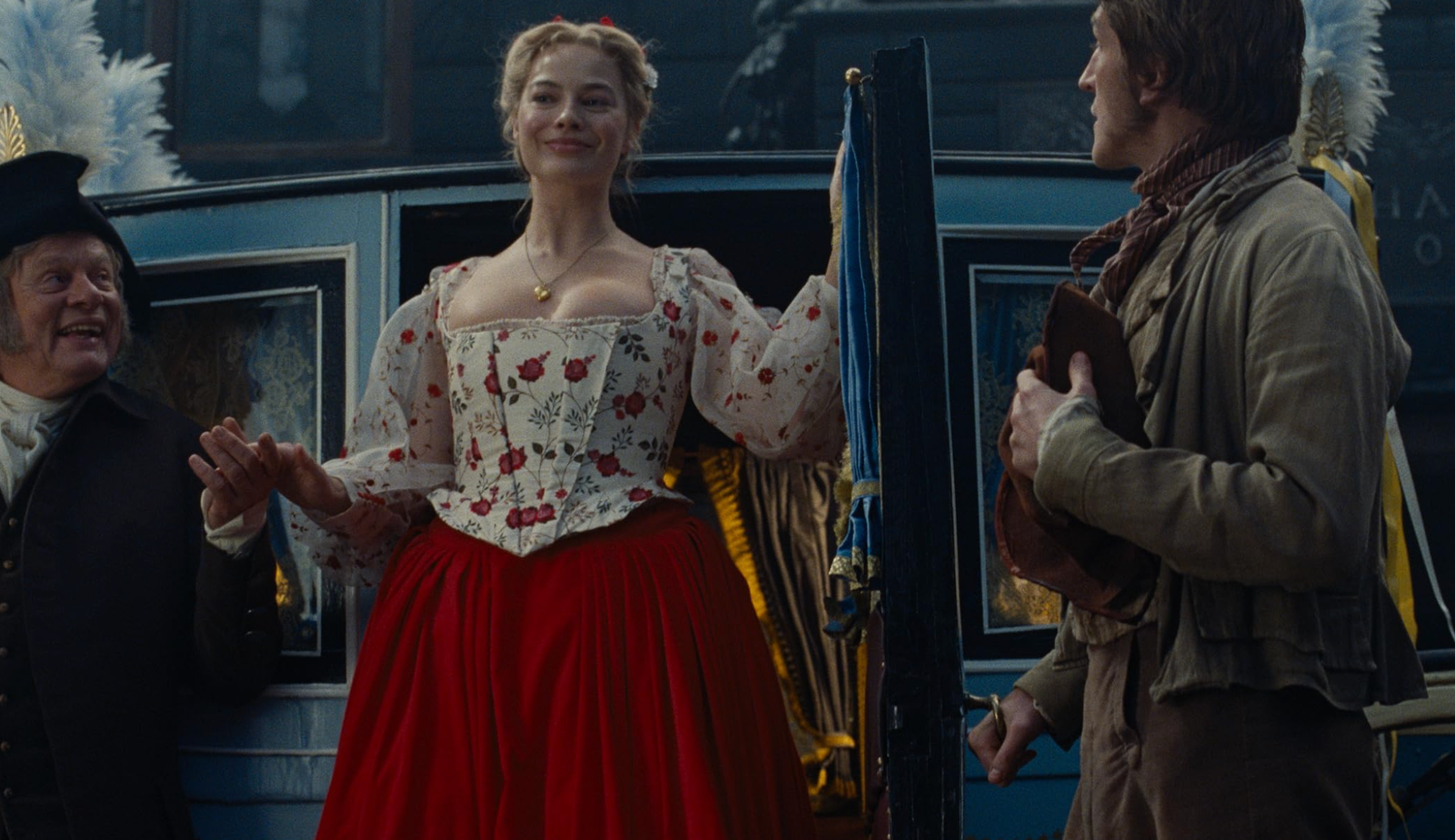
Costume design reinforces this severity. The clothing appears practical, heavy, and worn rather than decorative. Fabrics look coarse, layered, and lived-in, suggesting lives shaped by endurance more than refinement. There is a notable absence of romantic softness in silhouette or styling. Even moments that might traditionally be framed as intimate feel restrained, almost defensive. The costumes do not soften the characters as you might have expected, they ground them.
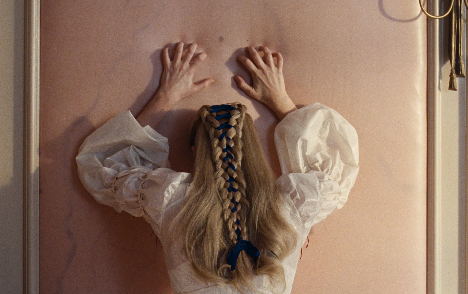
The first thing I noticed as I started watching it was this refusal to beautify the story. Rather than presenting Wuthering Heights as a sweeping romance, Fennell’s adaptation appears to foreground obsession, emotional cruelty, and power imbalance. Everything looked raw.
Visually, this is reflected in tight framing, lingering close-ups, and a sense of constant emotional pressure. The camera often isolates characters within the frame, even when they share space, reinforcing distance rather than connection.
As disconnected as the story I was watching on the screen generally felt to the one in the book I read twenty years ago, I have to admit that the uneasy feeling of constant discomfort and anxiety felt deeply loyal to the emotional violence at the heart of the original novel.
Courtesy of Warner Bros. – © Warner Bros.
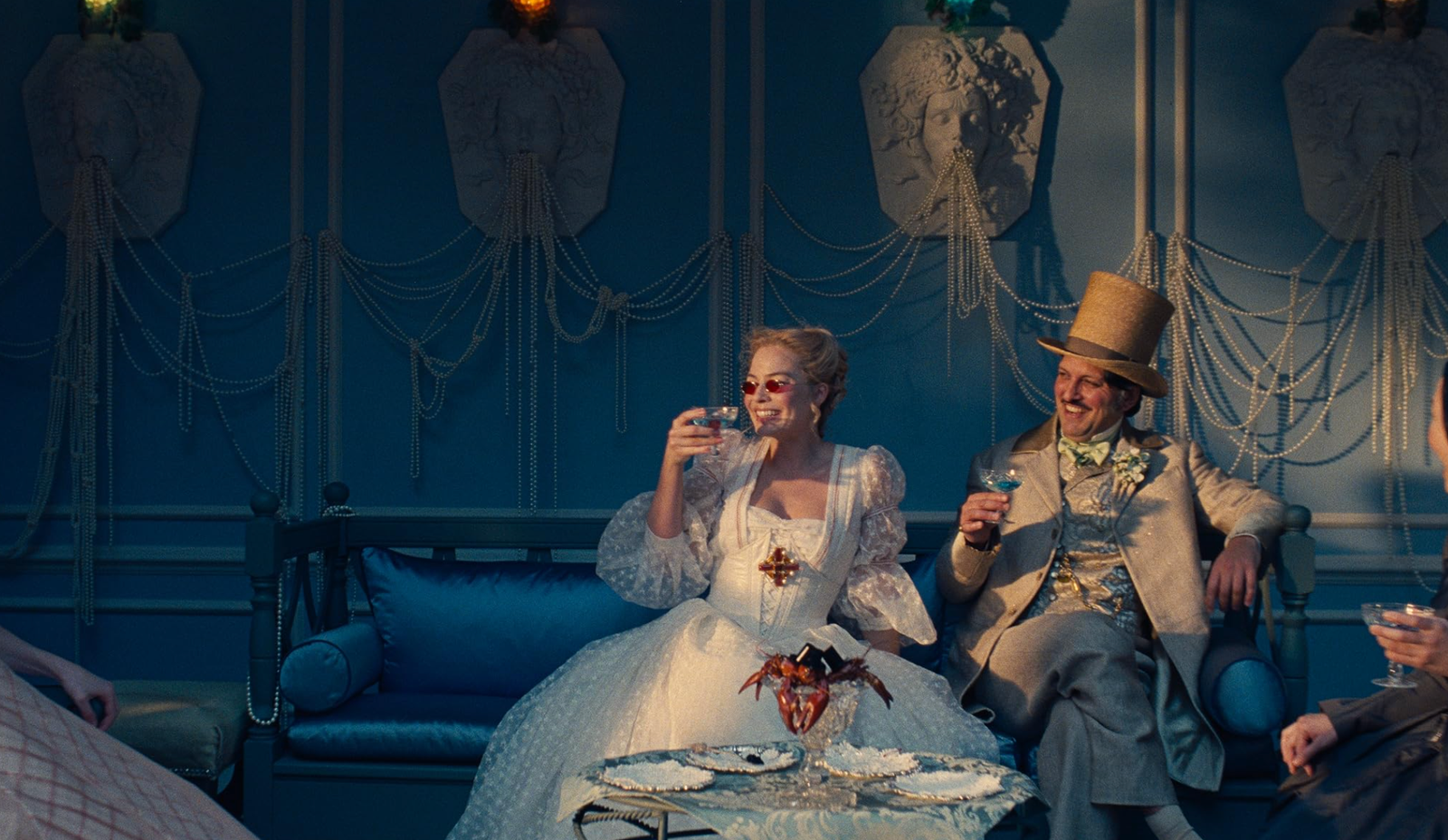
But here’s the thing: what makes this adaptation particularly interesting is how its aesthetic extends beyond the film itself. The promotional strategy has been aligned with the movie’s tone, a trend that has been becoming strong lately.
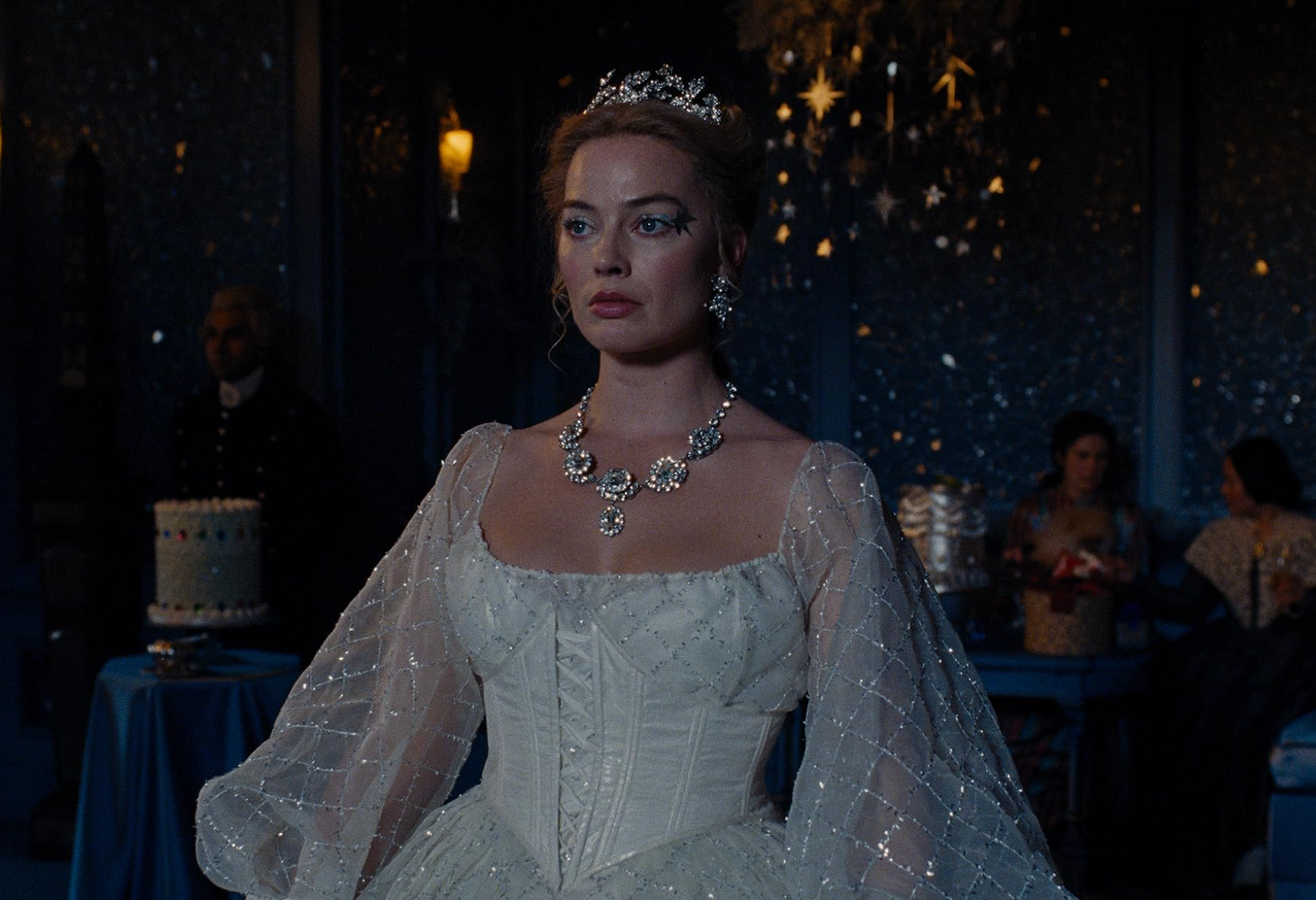
Margot Robbie’s press tour wardrobe feels less like traditional red carpet dressing and more like an extension of the film’s visual world. Her looks consistently reference gothic restraint rather than overt glamour. Long silhouettes, sharp tailoring, dark or muted color palettes, and minimal styling choices dominate her appearances.
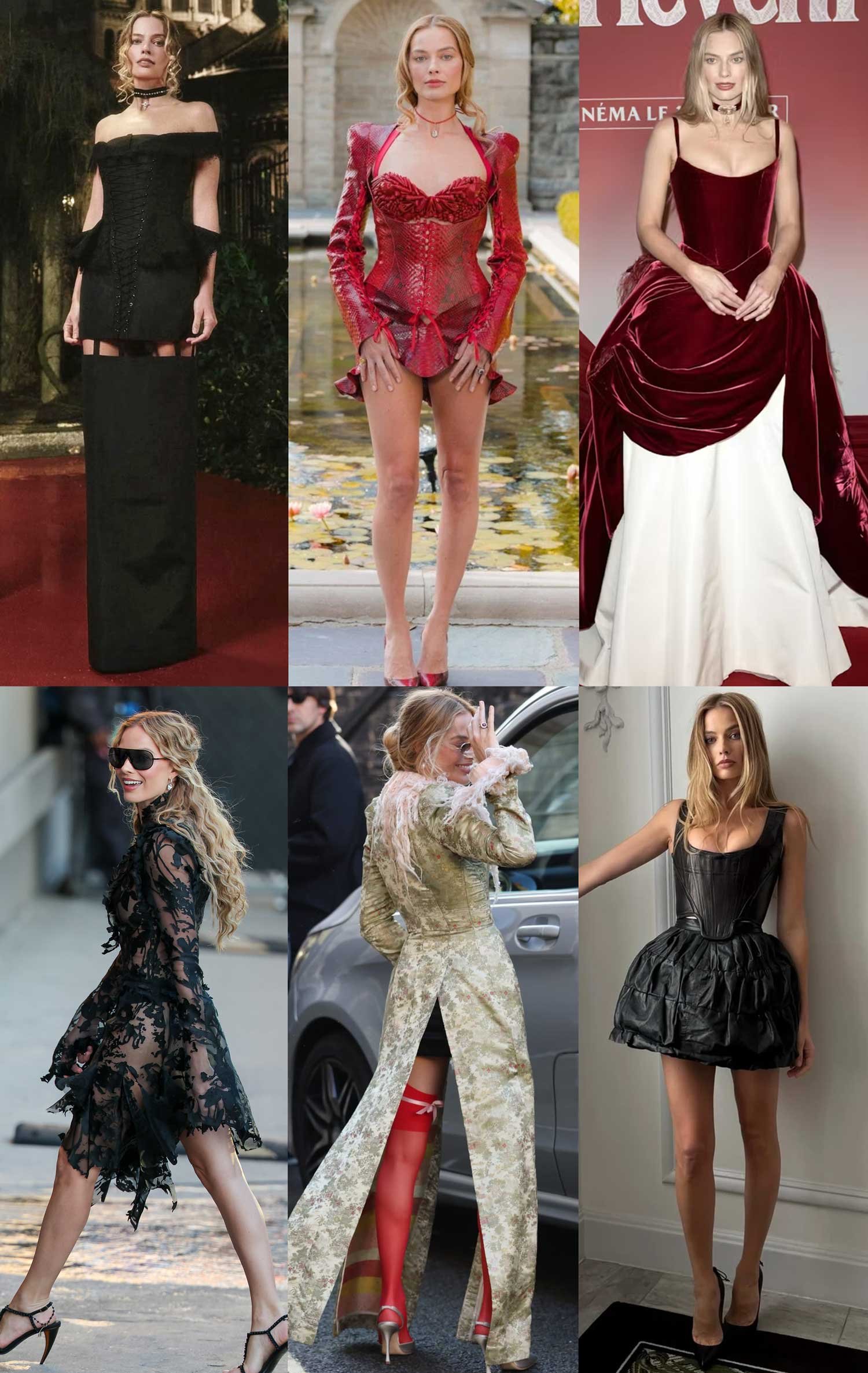
In accompanying fashion editorials and promotional shoots, Robbie and her co-stars were styled in a contemporary language that echoes the film’s mood without directly referencing period costume. There is a strong emphasis on texture, contrast, and emotional presence. Sheer fabrics appear alongside structured garments. Romantic elements are grounded by severity rather than sweetness. The result feels modern, controlled, and intentional, reinforcing the idea that this Wuthering Heights is less about nostalgia and more about psychological intensity.
This approach resonates strongly with current aesthetic currents. There has been a noticeable shift toward a quieter, more introspective gothic sensibility in fashion, film, and visual culture. One that favors atmosphere over spectacle and emotional depth over decoration. Fennell’s adaptation is perfectly attuned to this moment. It draws on gothic tradition while translating it into a contemporary visual language that feels restrained, intelligent, and emotionally charged.
After finally watching it we can confirm that Wuthering Heights was not designed to comfort its audience. Visually or emotionally. Its beauty lies in tension, in weather, in silence, and in unresolved feeling. Every image shared publicly feels considered, from the bleakness of the landscapes to the severity of the styling choices.
For a story that has been adapted countless times, this version is undeniably unique as it commits fully to a visual language that treats darkness, obsession, and isolation as something to be felt rather than merely observed.
And as an aesthete, I think that’s pretyy cool.